Phase 2: Brand Refresh
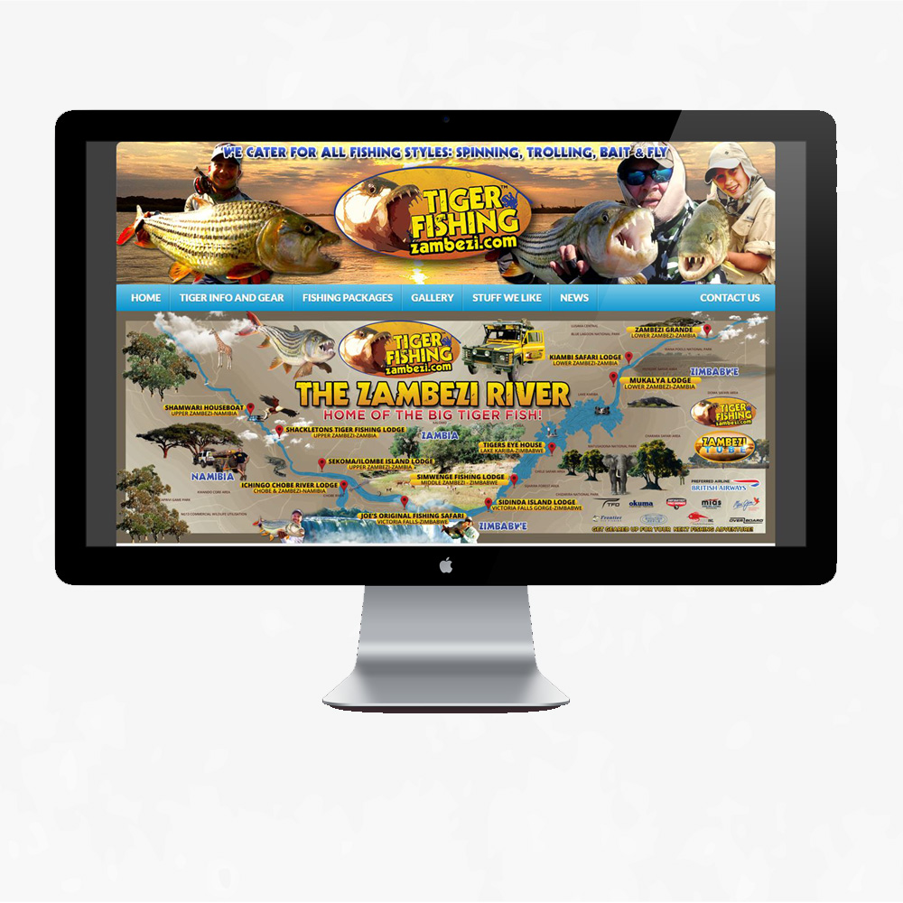
Map Design:
The background colour is a natural dusty brown much alike when you travel on dirt roads.
For the main colours I used yellow, a hint of red and a hint of blue. The yellow, which I used the most, was for the heading and labels because I aimed for these objects to standout first. The red colour was used for the subheading and icons to indicate the lodges. The red colour sort of blended in with the background hence I chose not to use this colour as the main colour. Blue was used for countries.
The fonts I used was Decade for the headings and Gotham for the smaller text and sub headings. The border I added kept the design in one place and gave it some structure. To bring the concept (realistic experience) alive, I added photos from client’s trips and safari photos such as fishing, clouds, trees and other activities that I received from the lodges. The adjustment to the picture of the river from the old design was very simple, whereby I added a texture of ripples in the water to show movement. For the final touches, I added logos of the sponsors at the bottom right and Zambezi Tube which is platform used for fishing trip videos.