Client: EPSON
About the Client:
Epson is a Japanese electronics company and one of the world’s largest manufacturers of computer printers, and imaging related equipment. They usually promote with printers and accessories.
Deliverables:
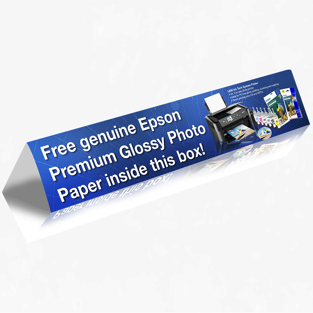
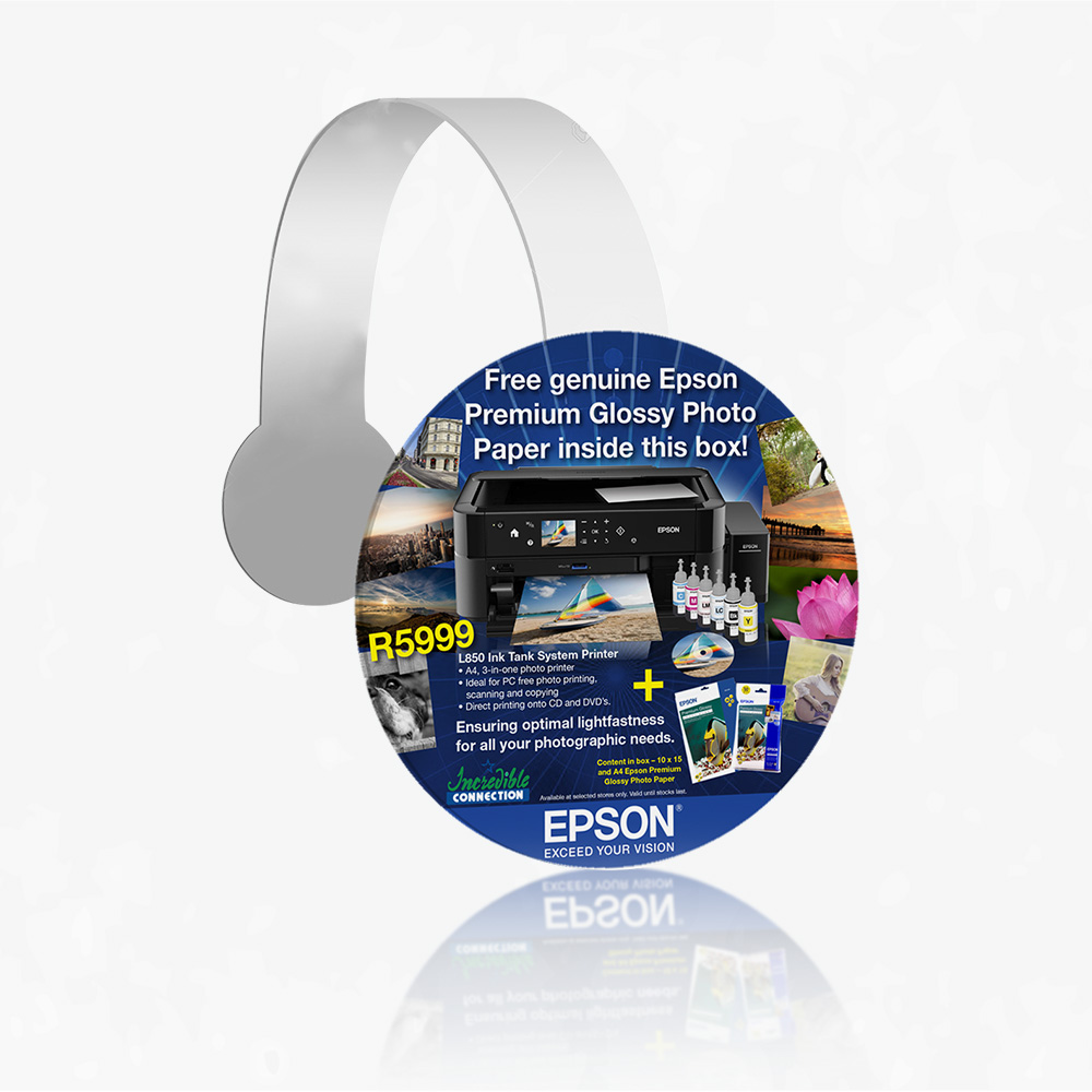
Flyers, Wobblers, Toblerone (triangular prism shape) and Back Board.
Challenge:
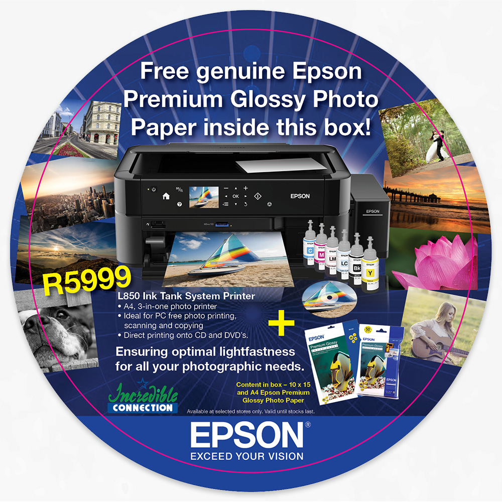
Epson teamed up with Incredible Connection to promote the L850 home printer. We had to create awareness around this product and the extra accessories that was displayed in the Incredible Connection stores. My challenge was to use one design and apply it to four different layouts and sizes.
Outcome:
To create one design and apply it to different layouts and sizes.
Phase 1: Strategy and Approach
Developing the strategy:
The first step was to brainstorm a concept and do research on the different concepts and ideas. As there was many concepts but the best concept was ‘Catching Memories’, it was about printing your memorable experience with your home printer on glossy paper.
Defining the Brand:
Epson is well known brand around the world. They use a dark blue and white as their primary colours. Their secondary colours are CMYK colour palette. The font they use is Helvetica and images used are realistic, experiences and their products. The white Epson logo sits in a blue shape that always placed on the right bottom corner of the page.
Understanding the User:
The users were anyone in their thirties and up, who wanted a home printer to save money from going to the printers shop. They are also getting ink and glossy paper, it’s good for professional photographers, portfolio work or even printing an experience as a gift.
Positioning:
To help consumer spend more time on their craft than running around looking for a good, affordable and quality printer shop.