Phase 1: Strategy and Approach
Developing the strategy:
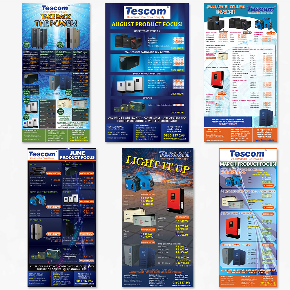
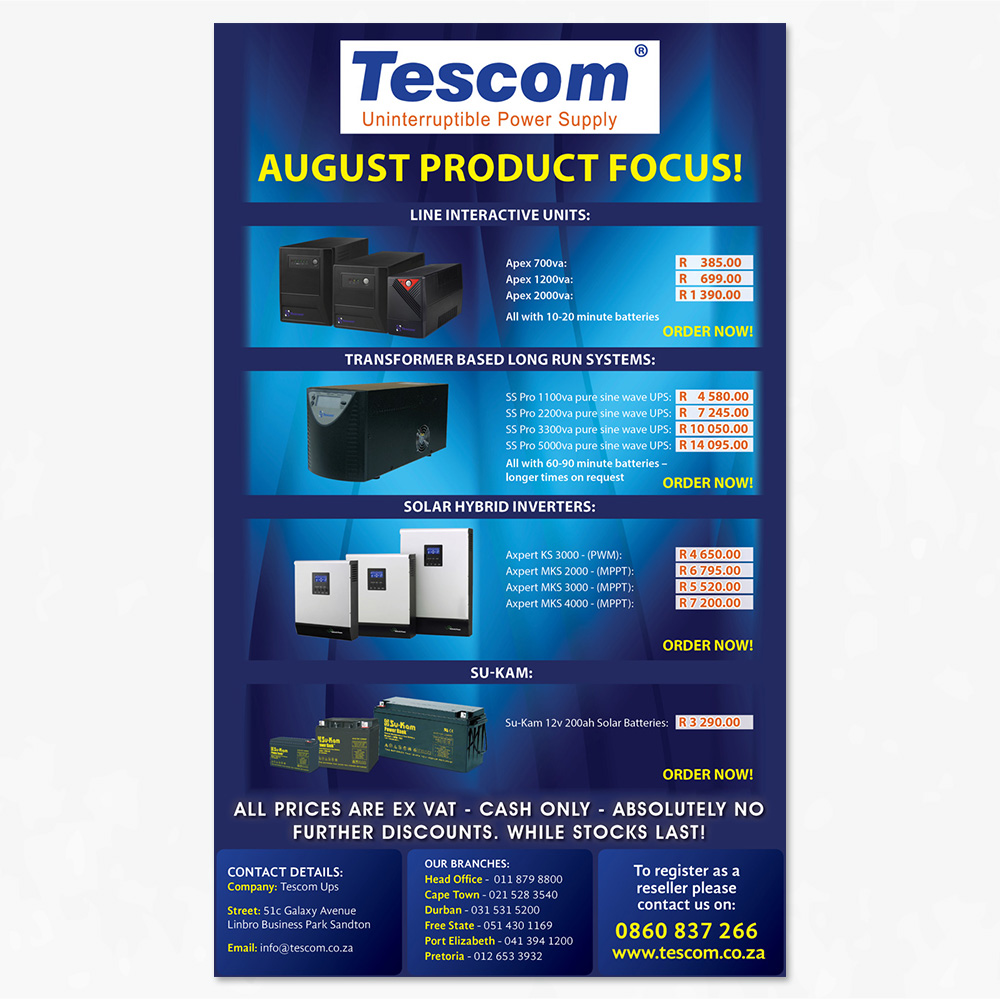
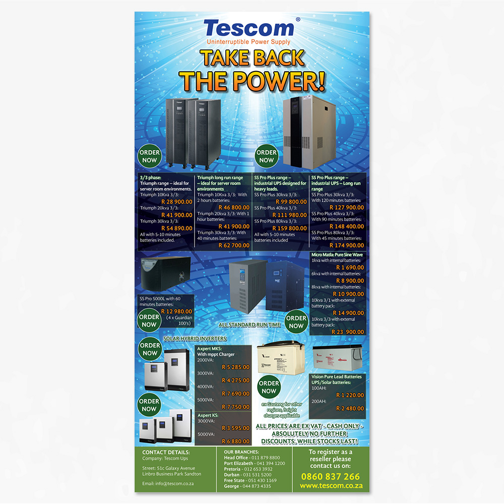
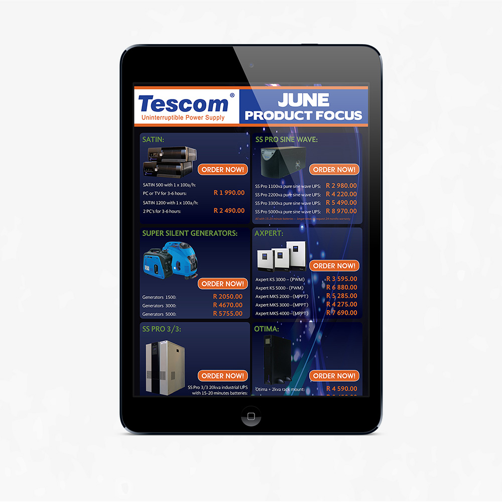
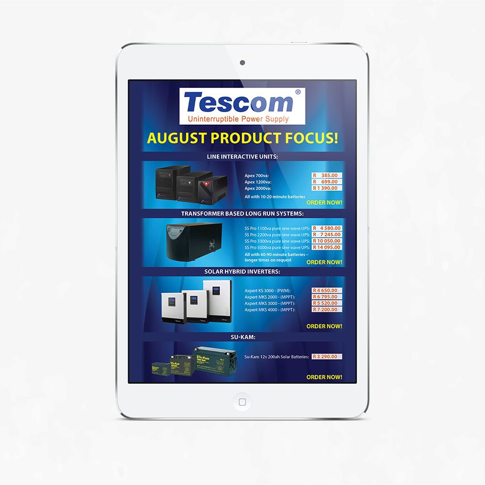
I always begin with researching power and electricity images, colours and fonts that fall in the same category. I’ll draw some layout ideas and look online for some ideas. I would look at the shape and sizes of the products and plan the layout from there. What works best for this mailshot was to two column layout design because it filled the space up equally.
Defining the Brand:
Tescom brand is mostly designed with a blue background and electricity or power images. Tescom doesn’t have its own Corporate Identity. To solve this problem I stuck to colours like blue, orange and yellow or sometimes green. The headline fonts changed but the text I tried to keep it as readable as possible.
Understanding the User:
Due to load shedding since 2008, many companies big and small need these power supplies for their businesses to keep running. No power, no productivity and no money.
Positioning:
Every month design a mailshot to be send to clients on the latest specials.