Phase 1: Strategy and Approach
Developing the strategy:
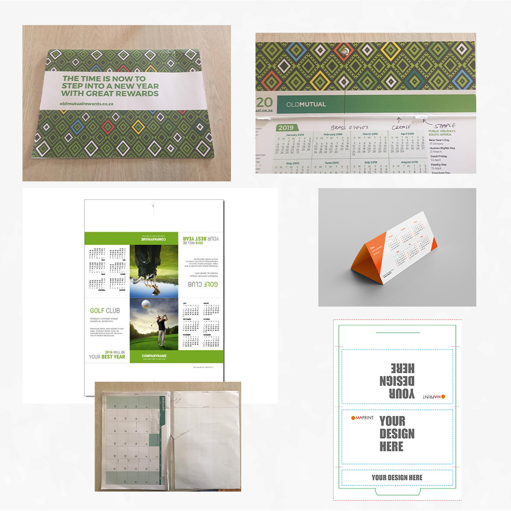
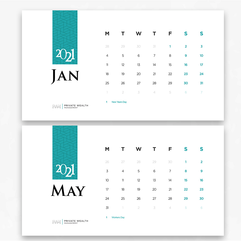
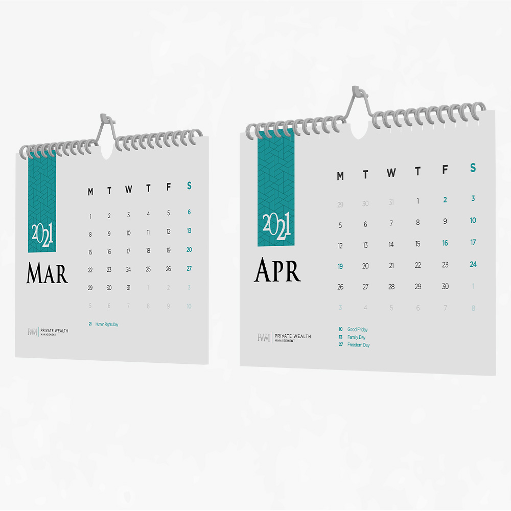
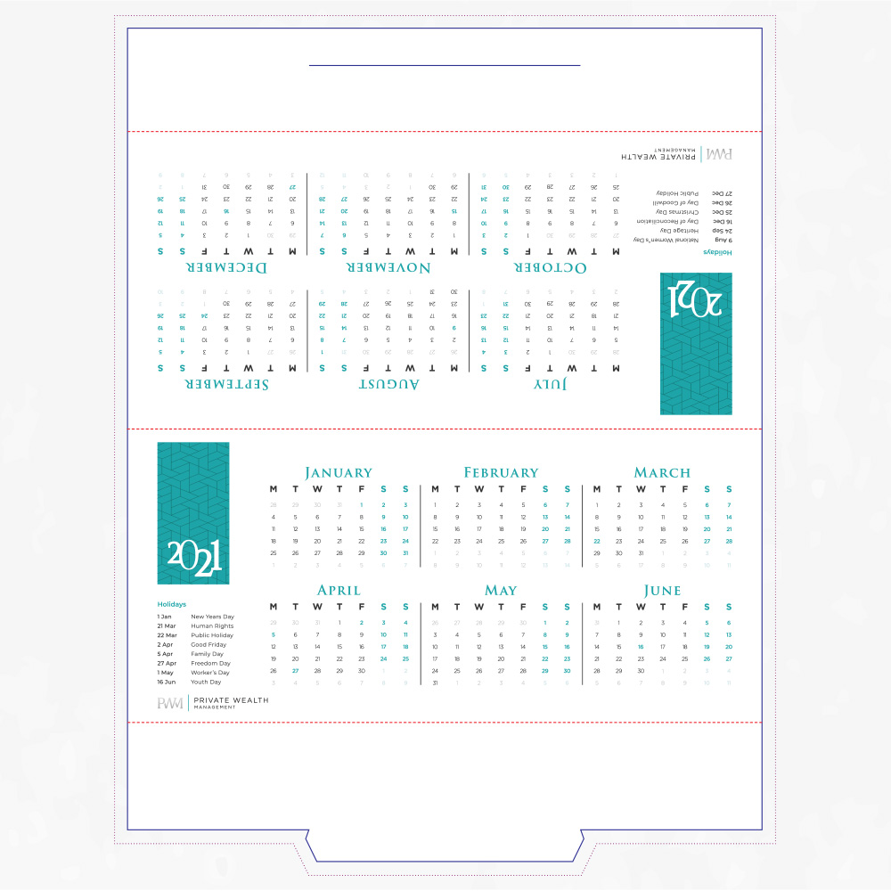
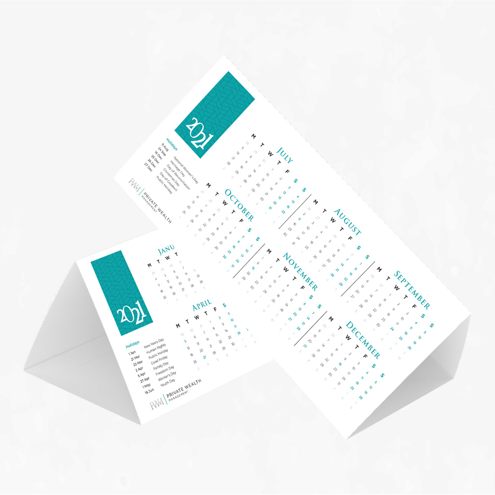
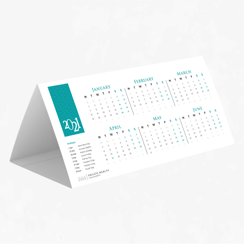
I received some designs from their previous company Old Mutual Private Wealth Sector. I used those designs as s template and idea of what they wanted. For the triangle calendar, I had to do some research on templates, sizes and how to prep for print. I found patterns from PWM forms and other graphics to apply to the design.
Defining the Brand:
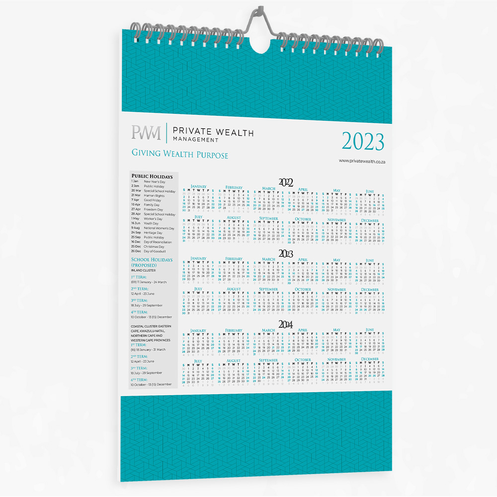
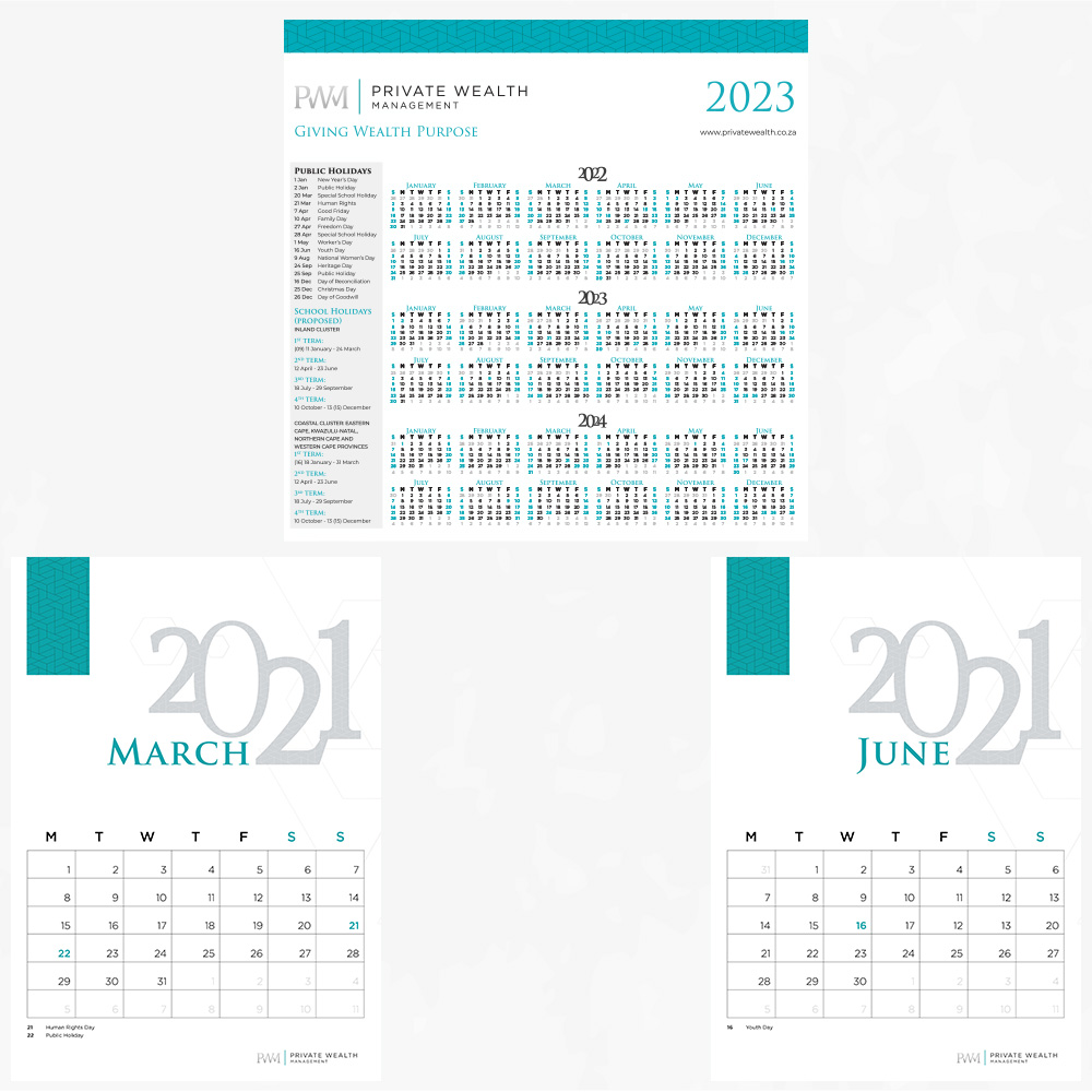
PWM slogan “Giving Wealth Purpose” means wealth is more than just money, it’s the key to unlocking new opportunities and pathways. The way we define this meaning is through the images based on the theme ‘Journey’. The primary colours are charcoal grey, silver grey and teal. There are six secondary colours which do not be used often, it’s more graphs and diagrams. The heading font that is used is called Cinzel and the Montserrat family are used for paragraphs.
Understanding the User:
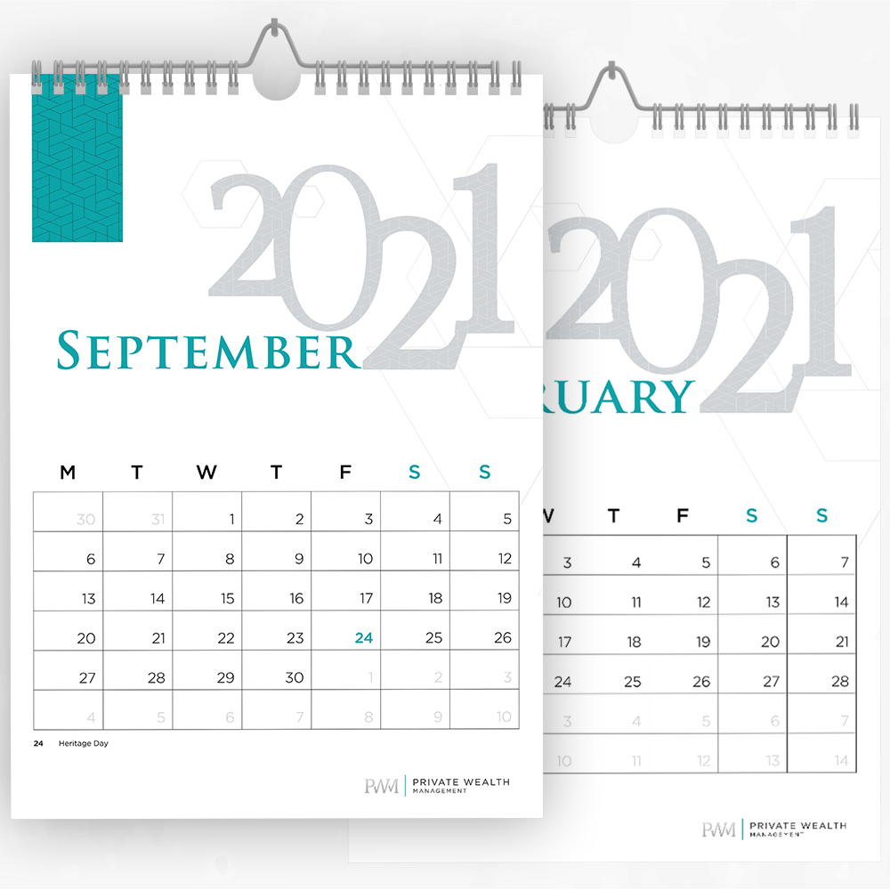
The users were employees of corporate companies and are all different ages. The triangle calendar is perfect size to check dates quickly. While the wall calendar is used to write down reminders and meeting dates. The important part is the size needed to be big enough to see and space to write on.
Positioning:
Design a triangle shape calendar and wall calendar for 2021.