Phase 1: Strategy and Approach
Developing the strategy:
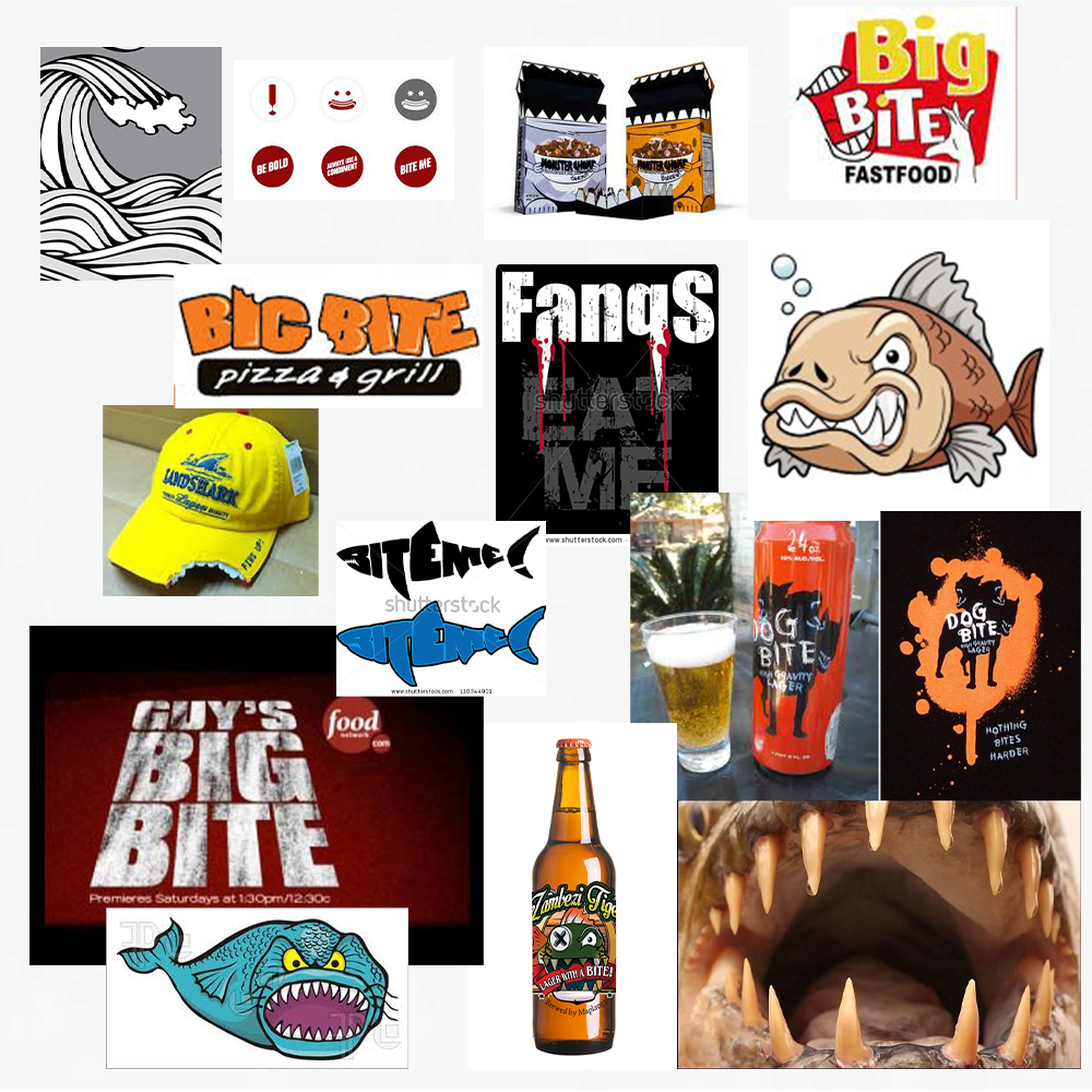
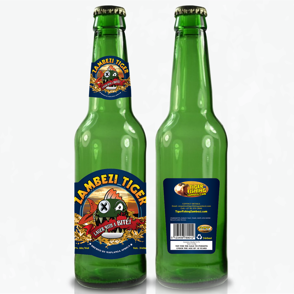
The concept was exploring the Zambezi River. I researched for all types of different styles of tiger fish, images of the river and the way the beer bottle is displayed. As this was my first time designing a beer bottle packaging, I had to look what was on the labels, lids and other important content. I did research on SAB and the different brands in South Africa.
Defining the Brand:
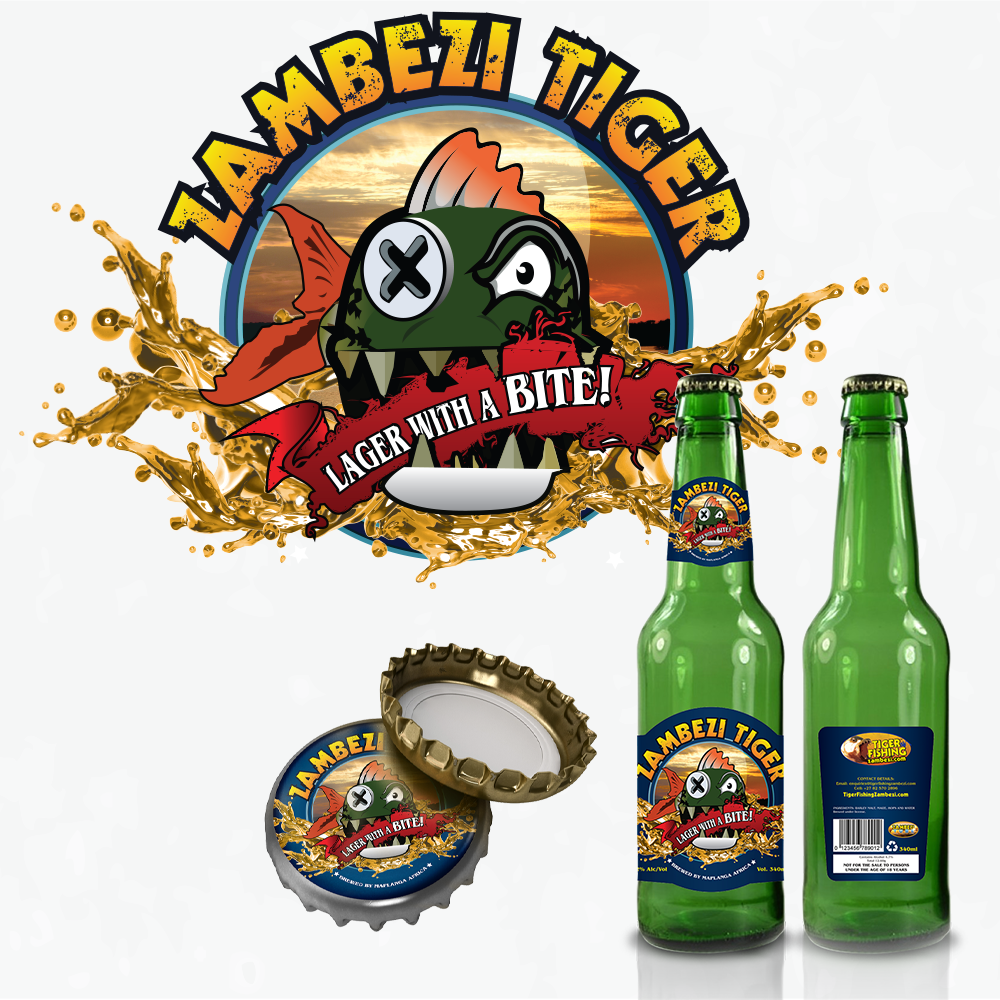
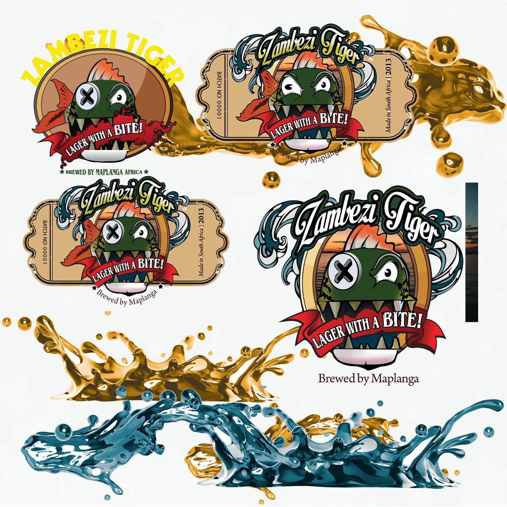
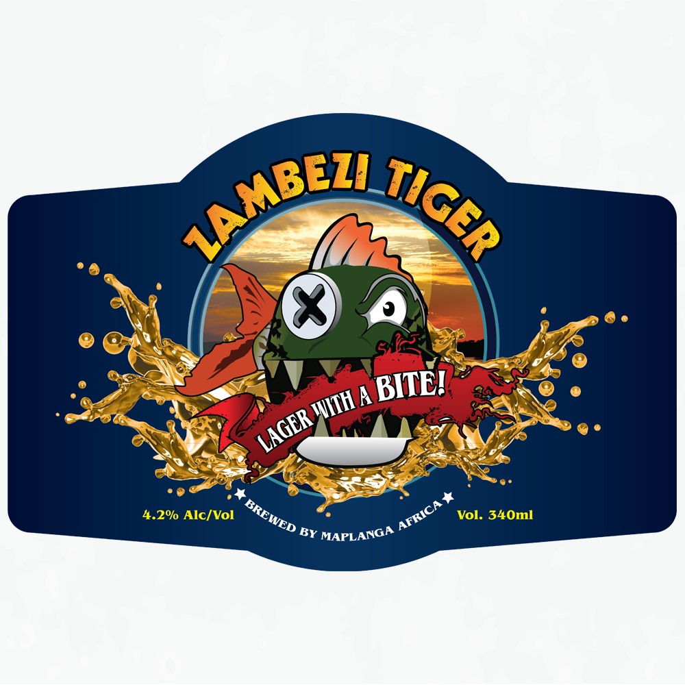
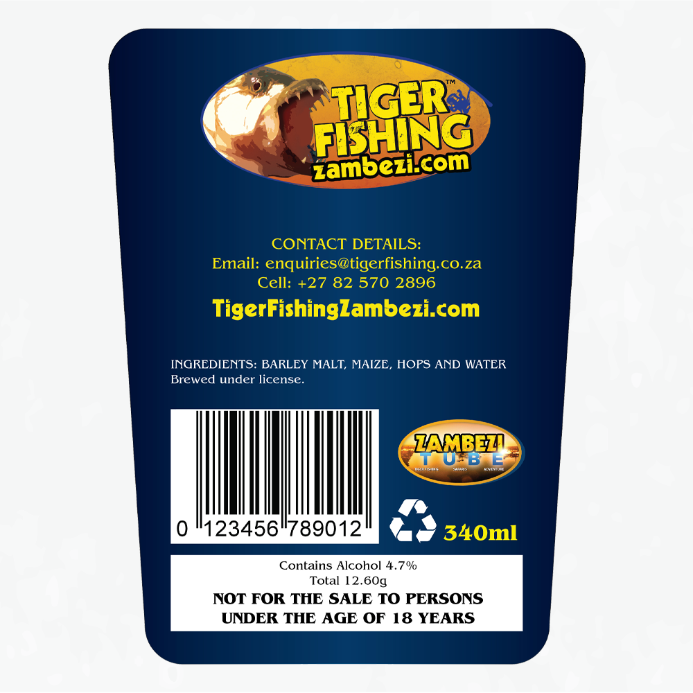
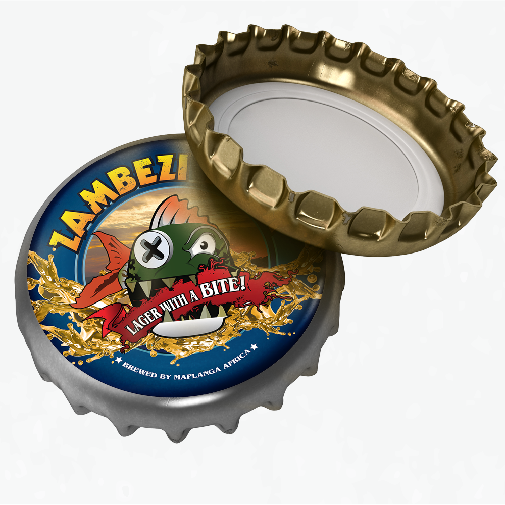
TFZ is a travel agency for fishing, they don’t have a Corporate Identity. My solution was use colours, fonts and images from past designs like mailshots and other marketing material. The main colours are used from the TFZ logo which are yellow, blue and black. The background from the logo is a sunset gradient and is a very popular element in our designs. The main style is a grungy and camping outdoors feel to the brand. This style emphasis being on holiday in the bush. Lastly the font used for the headings is called Decade and the font for cleaner and easy to read text is Gotham font family.
Understanding the User:
The users are people who want to go fishing and relax the whole day on the boats with their cold beers or cold drinks.
Positioning:
Design a beer bottle packaging called Zambezi Lager.