Quarterly Newsletters

Graphic Design

Client: Private Wealth Management (Pty) Ltd

About the Client:

Private Wealth Management (Pty) Ltd (PWM) is a registered Financial Services Provider established to meet the lifestyle financial planning needs of individuals in the affluent and professional market.

Deliverables:

Quarterly e-Newsletter 2020/2021

Challenge:

Create a template for an e-newsletter that will be send out every quarter of the year.

Outcome:

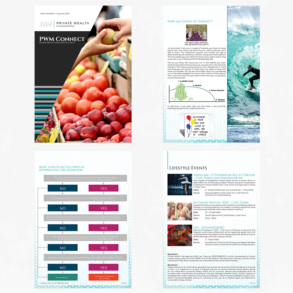
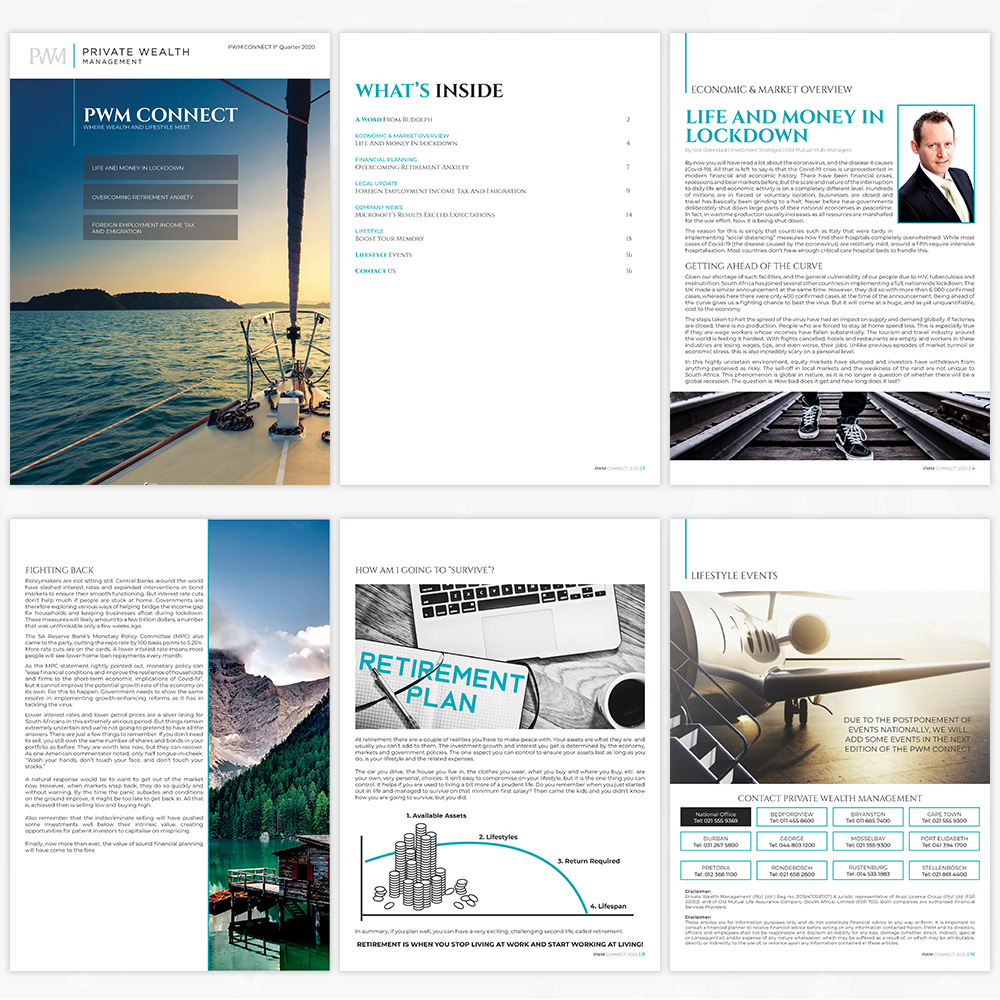
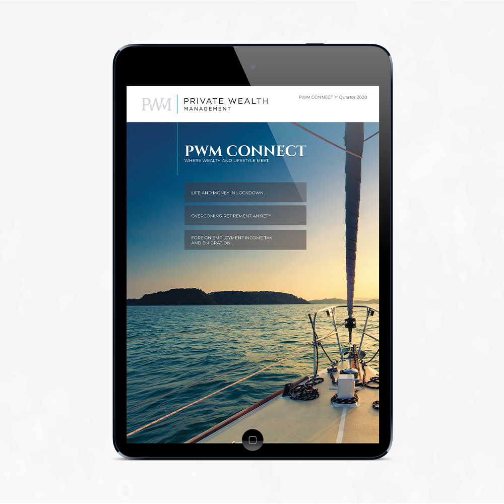
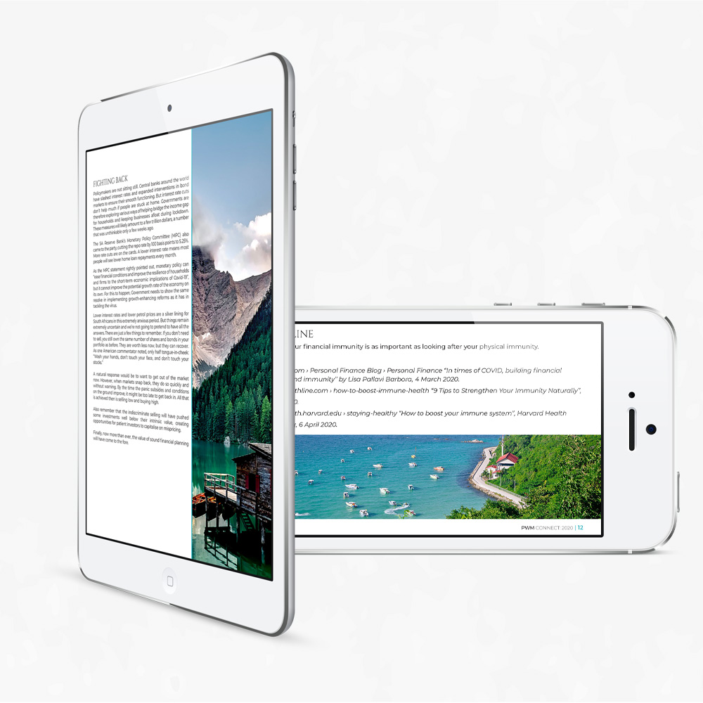
The e-newsletter is called PWM Connect Newsletter. Every start of the season in South Africa, an e-newsletter will be send out to their clients. They will receive the latest news within the company and advice.

What happened?

PWM was a part of Old Mutual Private Wealth sector but now is an independent company. The goal is to rebrand all their marketing material, which includes the e-newsletter.

Phase 1: Strategy and Approach

Developing the strategy:

I focused on their concept ‘Journey’, I researched images, patterns and borrowed and tweaked some layout ideas from Old Mutual Private Wealth e-newsletter. My main focus was to make this template simple to edit for future e-newsletter by using three different layout ideas and having rules for fonts, colours and spacing.

Defining the Brand:

PWM slogan “Giving Wealth Purpose” means wealth is more than just money, it’s the key to unlocking new opportunities and pathways. The way we define this meaning is through the images based on the theme ‘Journey’. The primary colours are charcoal grey, silver grey and teal. There are six secondary colours which do not be used often, it’s more graphs and diagrams. The heading font that is used is called Cinzel and the Montserrat family are used for paragraphs.

Understanding the User:

The users are interested in saving and using their money wisely. The age category would be 30 up to retirement. Their latest client turned 100 in 2021.

Positioning:

To keep the user up to date with the latest news and advice.

Phase 2: Brand Refresh

Brochure Design:

The quarterly e-newsletter design begins with a beautiful journey image with some headlines from the e-newsletter itself.

Thus follows the content page where I used the Cinzel font for the main headings and Montserrat font for the titles of the articles.

Each article written by a PWM member, begins with a vertical line running down the page on the left hand side and next to it is the category headline. Below the category heading is the article heading with the image of the writer on the right hand side. The next layout is a full spread where images are lined horizontal and is best used for graphs and diagrams. The second layout option is where there is a vertical image on the right and copy on the left.

The main colours used in this design showcases charcoal grey and teal. Some articles I received I had to copy as is. I ended off with a beautiful image on top and ended the design off with contact details below for the different branches situated in South Africa.

Phase 3: User Experience

Causing Delight:

The final e-newsletter was uploaded to the website by me and the client would send an email with a link to the users. All the brochures are available on the PWM website and it’s an easy access and simple to use.

Measure, Test, Adjust:

In the beginning of 2021 when I was uploading the latest brochure, I had a problem where I couldn’t send a unique link to the client. Hence I had to find a solution, after many trial errors, finally found a solution where the client was satisfied and happy with end product.

The Outcome?

The client is happy with my work and I’ve done eight e-newsletters.

Design Software

Trisha Deva

The journey is more important than the destination.

Date

March 14, 2020