The Process And Product Brochure

Graphic Design

Client: Majesty Oil Mills (Pty) Ltd Brochure

About the Client:

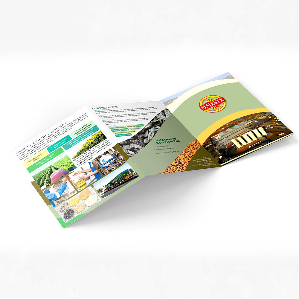
Majesty Oil Mills (Pty) Ltd is a privately owned company that manufactures a wide variety of soya and sunflower products for both animal feed and human consumption.

Deliverables:

A4 Trifold Brochure

Challenge:

Design a trifold brochure to attract potential clients that would be interested in the product.

Outcome:

 It was a success, the client printed 500 copies for the agriculture expo.

What happened?

An agriculture expo was happening in a few weeks’ time. The client printed 500 copies to be taken and handed out to clients that would be interested.

Phase 1: Strategy and Approach

Developing the strategy:

The client and I briefly discussed the brochure design before we had to meet at the Majesty Oil Mills (Pty) Ltd factory. There I met the photographer Antoinette Oosthuizen and copywriter Erica Fourie. During the meeting I showed them the three mood boards and the sketches I created prior the meeting. Edzisani took us for a tour around the factory, it was a eye opening experience to see how soy beans and sunflower seeds are manufactured.

Defining the Brand:

Walking through the factory and experiencing all my five senses, truly inspired me to tweak my mood boards for a dynamic look and feel.

Understanding the User:

The user would be known as the middle man and with the brochure the user will be able to show their employee what Majesty Oil Mills (Pty) Ltd produces and sell. Contact details are on the brochure if the user has any queries or would like to purchase for Majesty Oil Mills (Pty) Ltd.

Positioning:

The brochure is clear and straight to the point of what products produce and sell. To include they use their own products to cook food for charities.

Phase 2: Brand Refresh

Brochure Design:

The brochure is an A4 brochure that has a three-panel fold. The size is 297mm height and 630mm wide.

The final colours that were used are light pastel colours, which makes the brochure feel grounded and it supports the logo colours by allowing it to stand out. The curve design in the front and the back cover represents the flow process of the results of the quality products.

The font used in this design was HPSimplified for the main copy because this font visually stimulating. The heading font was Classizism Antiqua, a different main-copy font as this font is bold and catches your eye from the far. The products, process and the factory itself was taken by Antoinette but some general photos were found on pixabay.com to define the brochure in a different perspective.

Phase 3: User Experience

Causing Delight:

The brochure was a success. The client was happy with the final product. The brochure answered all the requirements as requested in the brief and we were able to add an extra portion of detail, which was the charity work Majesty Oil Mills (Pty) Ltd contributed in.

Measure, Test, Adjust:

By printing copies of these brochure, it truly helped the client to expand their knowledge and answered many questions on Majesty Oil Mills (Pty) Ltd. Contact details were vital as many users contacted them to find out more about their products and process.

The Outcome?

It was a success, the client printed 500 copies for the agriculture expo. My belief the brochure will be used for many years to come until a new process is developed or new products to be sold.

Design Software

Trisha Deva

"It's important to have a balance diet"

Date

June 2, 2019